
Review: Somnia
Classic review by Heather • February 2013 • The RPG (as it was)
This is a review of the RPG Somnia.
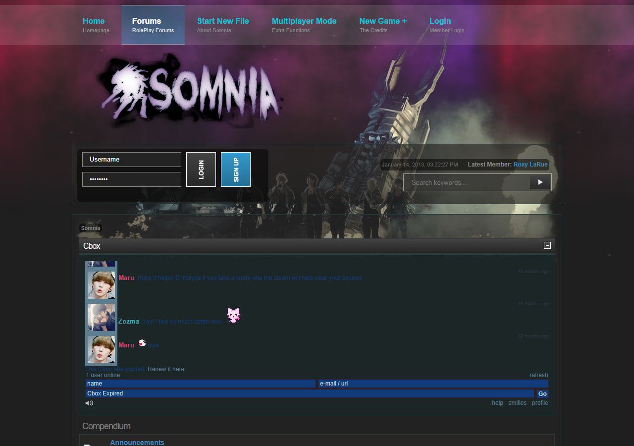
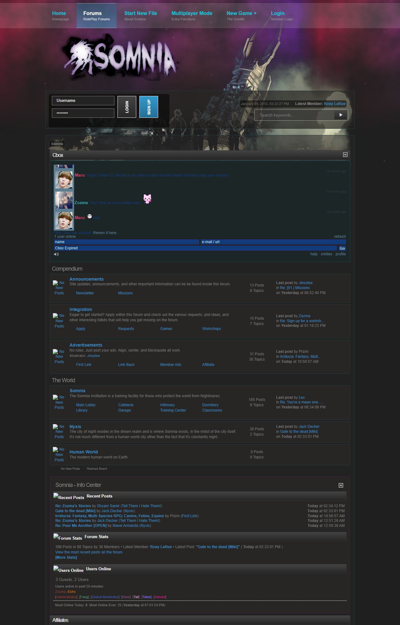
Screenshots from the Wayback Machine, captured 2013-01-14.
| Style of RPG | Forum; self-hosted SMF |
|---|---|
| Canon/Genre | Fantasy; Alternative Universe. |
| Originality | Similar to the ideas behind the movie Inception but less corporate espionage and more about a secret war that no one knows is happening. It is another "secret war" style RPG but with a more original setting. |
| Rating | Mature rating, only accepts players over the age of 13. |
| Amount of Characters | Approximately 71; I could not find a list of characters any where and had to take this number from the characters listed on the 'face claim' list. |
| Date Opened | Unknown. |
| Roleplaying Level | Intermediate to advanced. |
| Average Post Length | Generally between 3 - 5 paragraphs in length. |
| Activity Level | New replies daily. |
| Characters Accepted | Original. |
| Appearance | While I can appreciate the aesthetic ideas behind the header, I do have to be honest; it initially looks like a child went nuts with MS Paint. The rest of the site boasts a neat, mature style and the header just demolishes all that. Header images are the first part of your site/forum that people see because it is at the top of your page. Unfortunatly some people do go by first impressions and whether you agree with that or not (personally I always investigate further) you can't ignore the fact that some visitors will do that. There are plenty of resource sites and sites such as Deviant art where you can find someone to make something for free. |
| Navigation | It is a little confusing at first because of the names given to the sections in the menu. For example, "Start New File" made me automatically assume that all information under that would be about creating a character. Where as it's where all the information about the RPG exists. This is more an aesthetic issue as the titles are in a bright blue which draws the eye, while the sub-headings which accurately explain each section are overlooked in the pale grey. Just a little thing but it can make a difference when trying to hook potential members. |
| Plot Information | Very thorough and intriguing although another tip to make it user friendly is to try to break the page up a bit. Sub-headings such as 'summary' and then 'teams' or 'recruitment' would make it easier to navigate for visitors returning to the page to find something they remember reading the first time. |
| RPG Information | A nice amount of additional information regarding the different factions and levels of nightmares. |
| The Admin | Other than the Cbox there doesn't appear to be any methods to contact the staff, nor can I find any references to how a visitor could ask questions or find answers (FAQ for example). |
| Application Process | There is no template or bio to post, instead character details are listed on the sub-account for each character. There is a thorough description of this, however, it is a very dense text document. Try breaking it up with some screenshots to help guide people. My general rule of thumb for any website is to treat people like they are idiots because everyone sees things differently. Something that may seem obvious and well explained to you may be completely different to another person. Believe me, I've been there. |
| Other Comments | I do my best to view each site as a separate entity, especially when I am reviewing RPGs run by the same person because every RPG is different. However, I have previously reviewed another site by the same staff and I do feel that my best advise here is to say look at what you've done with that RPG and use that as an example. Also as an adult that likes to play adult storylines I do find it a little off-putting that if I joined this RPG I could be posting in a mature setting with someone as young as 13. Normally I wouldn't speak for everyone, however, based on experience I do know that it's not something a lot of adult roleplayers would be comfortable with. |
Archived from distant-fantasies.net/reviews/r/somnia.php